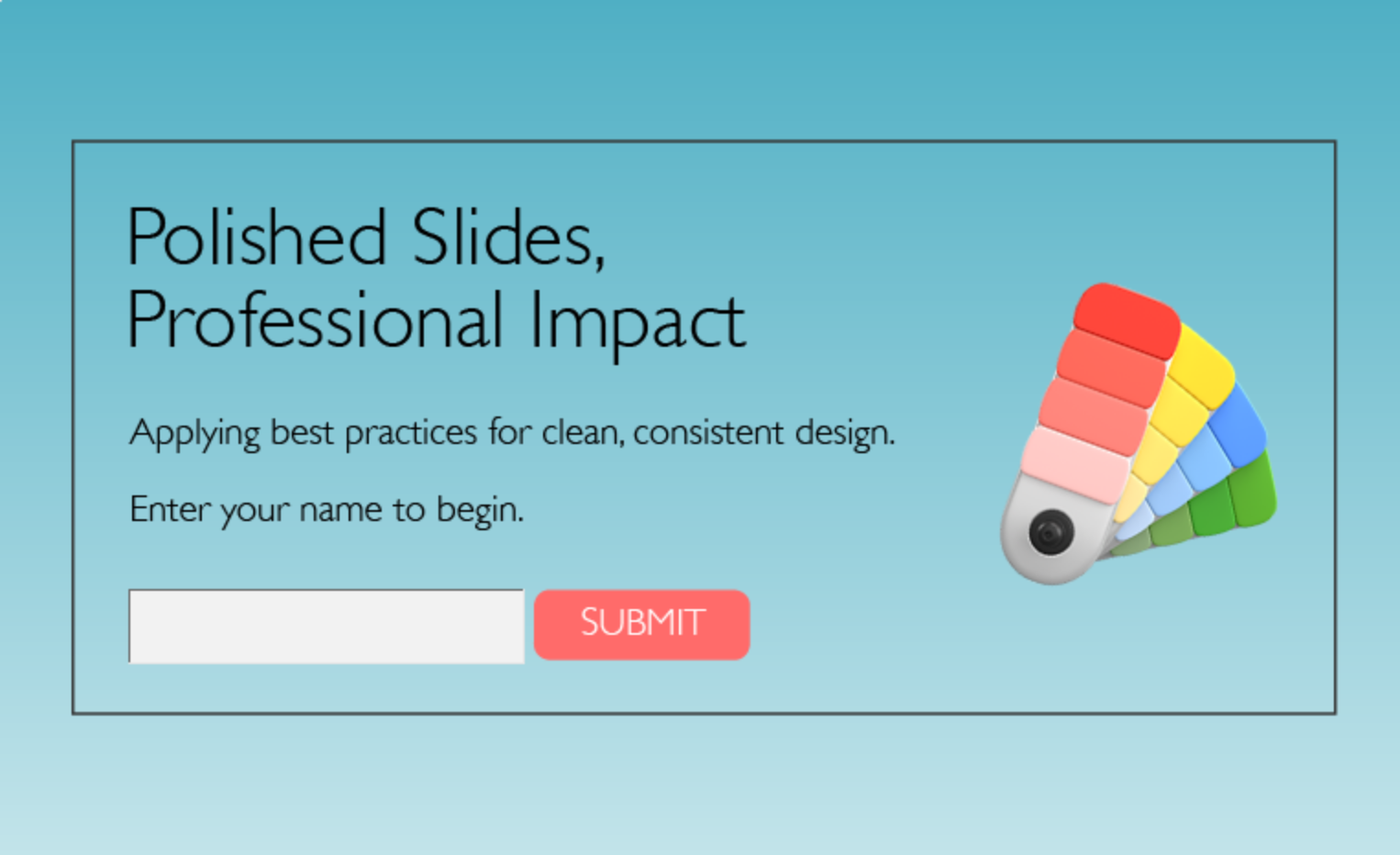
Polished Slides for Professional Impact
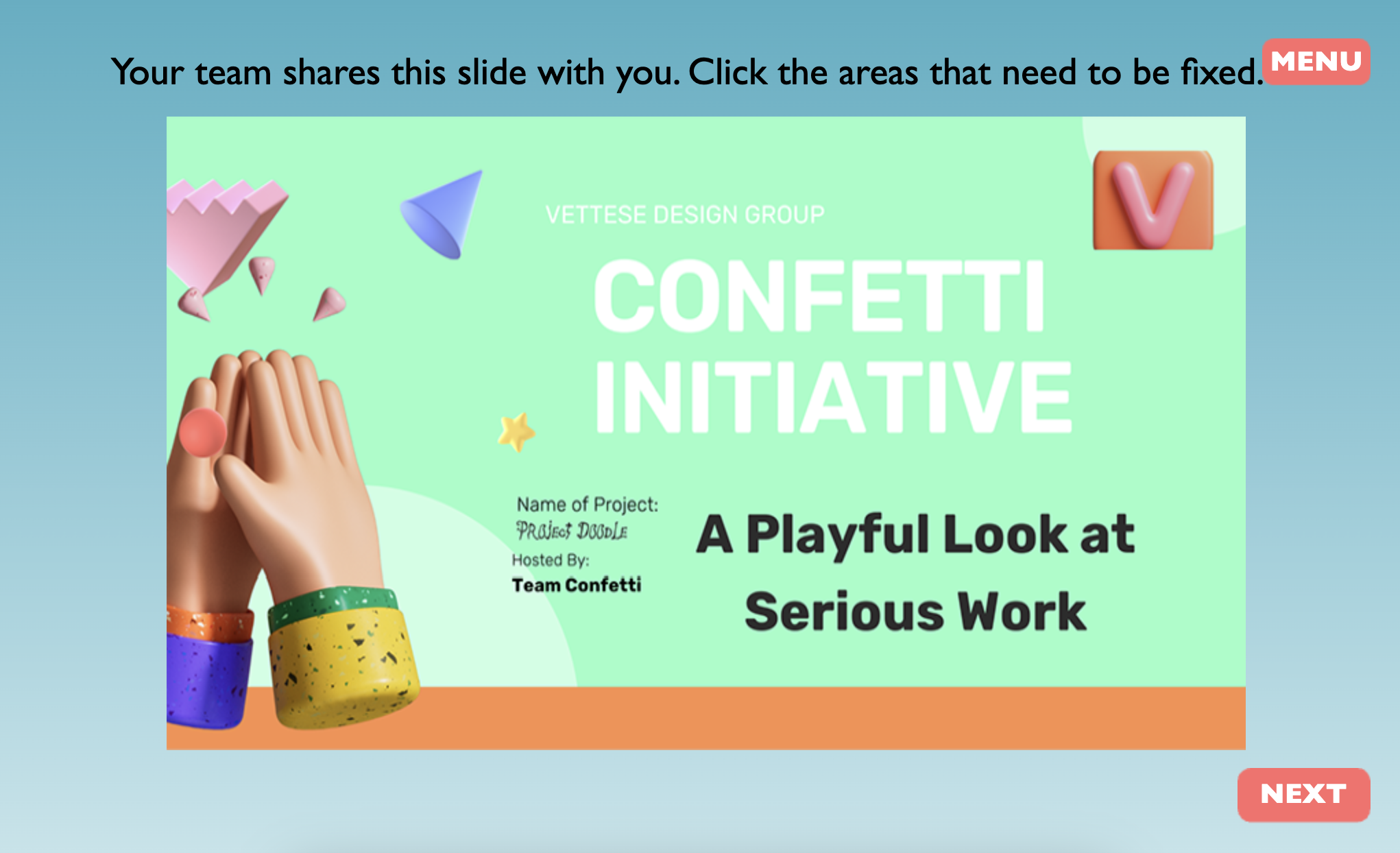
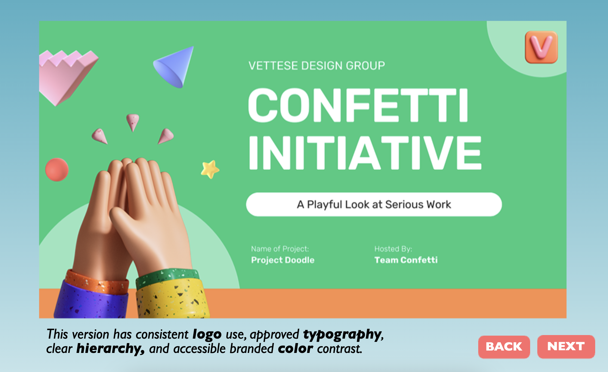
I created this microlesson in Adobe Captivate Classic focused on improving brand consistency across slide design. The lesson demonstrates how visual hierarchy, typography, logo usage, and a consistent color palette influence the viewer’s experience by contrasting a poorly designed slide with an improved version.
Because Captivate has limitations with typography and asset handling, I integrated external 3D elements from Adobe Stock, refined them in Dimension, and imported them into Captivate to elevate the look and feel. This process pushed me to troubleshoot multi-state object bugs and balance creative vision with technical constraints. This challenge strengthened my adaptability in Captivate Classic.
This project reflects my philosophy as an instructional designer by balancing aesthetics, usability, and instructional clarity.